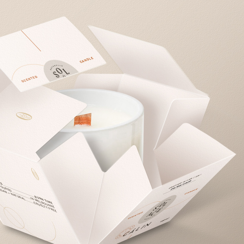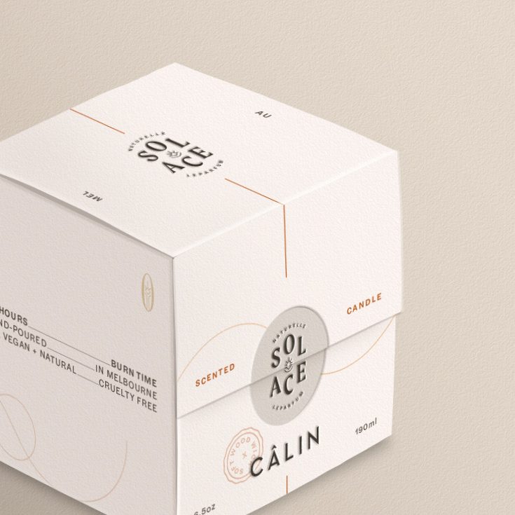

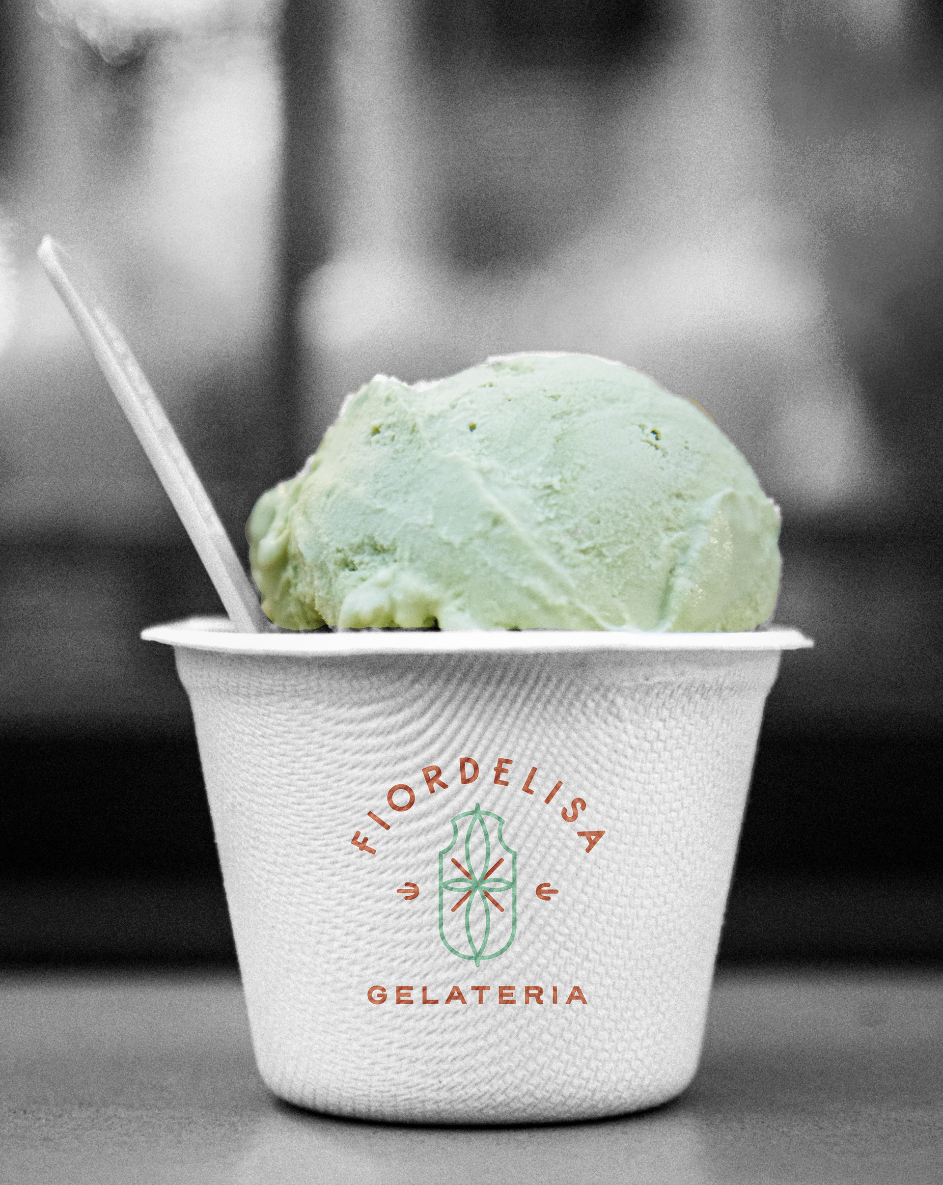
Fiordelisa is an authentic Italian gelateria based in Melbourne, Australia. They make handcrafted small-batch, fresh gelati from scratch, in-store— using imported bona fide Italian machines and equipment as well as the finest, ethically sourced ingredients.
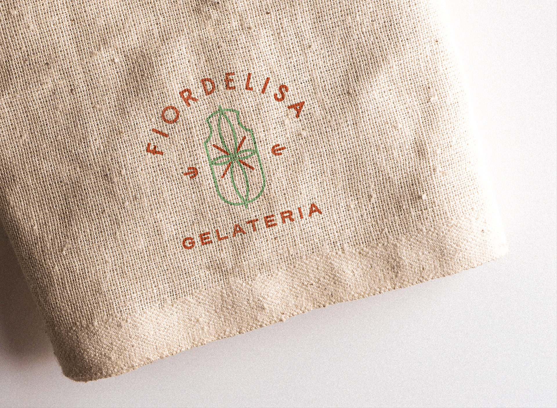
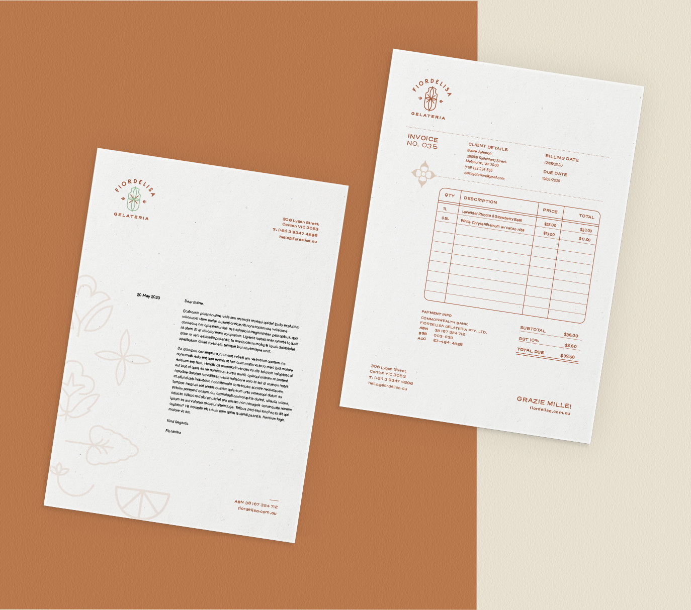
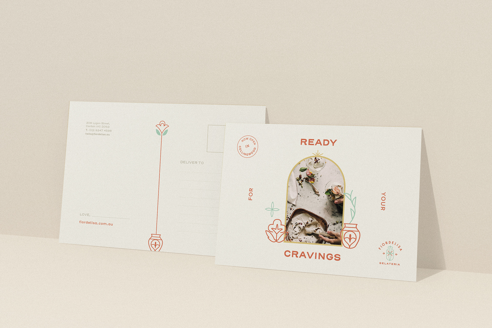
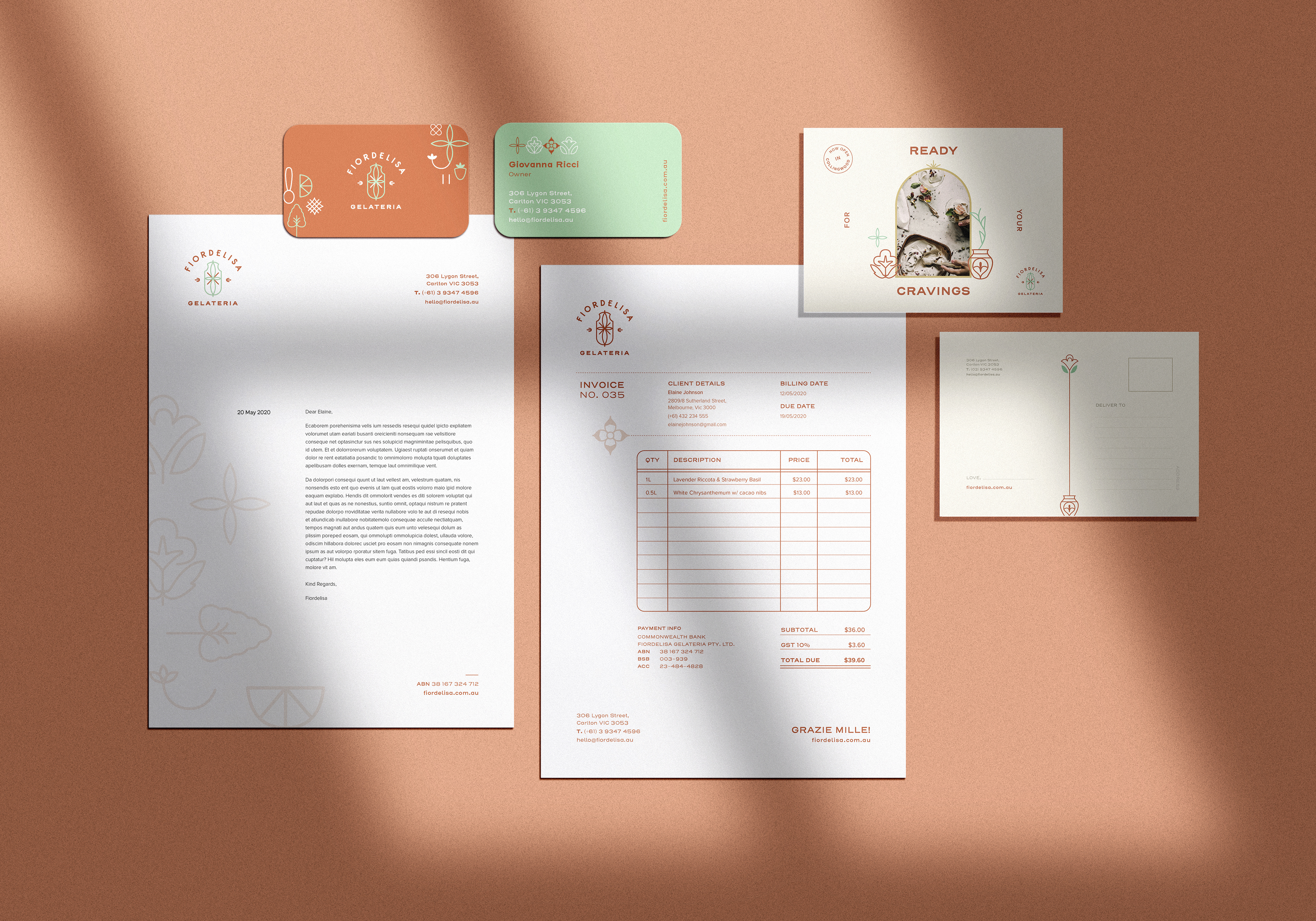
The brief was to design a brand visual identity, logo and business collaterals such as invoice, letterhead, business card, and promotional postcards.
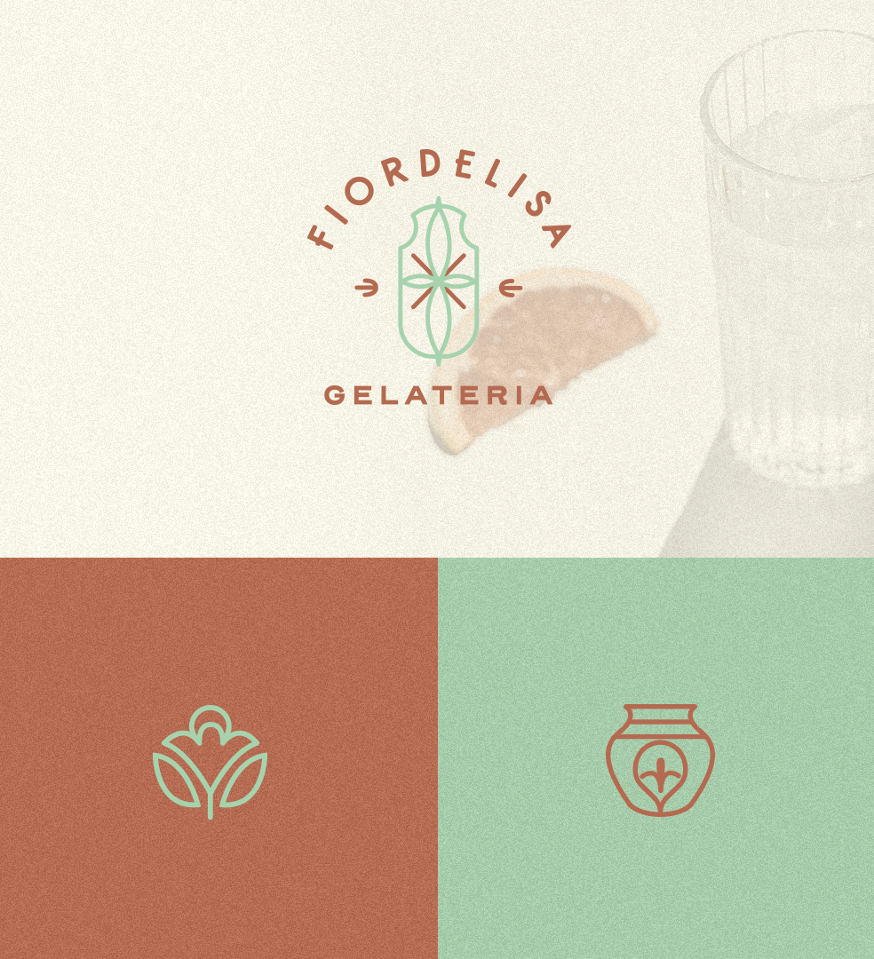
Going out of the norm as a first in Melbourne, Fiordelisa takes a spin on naturale gelato, crafting light-coloured, botanical and floral gelato flavours.
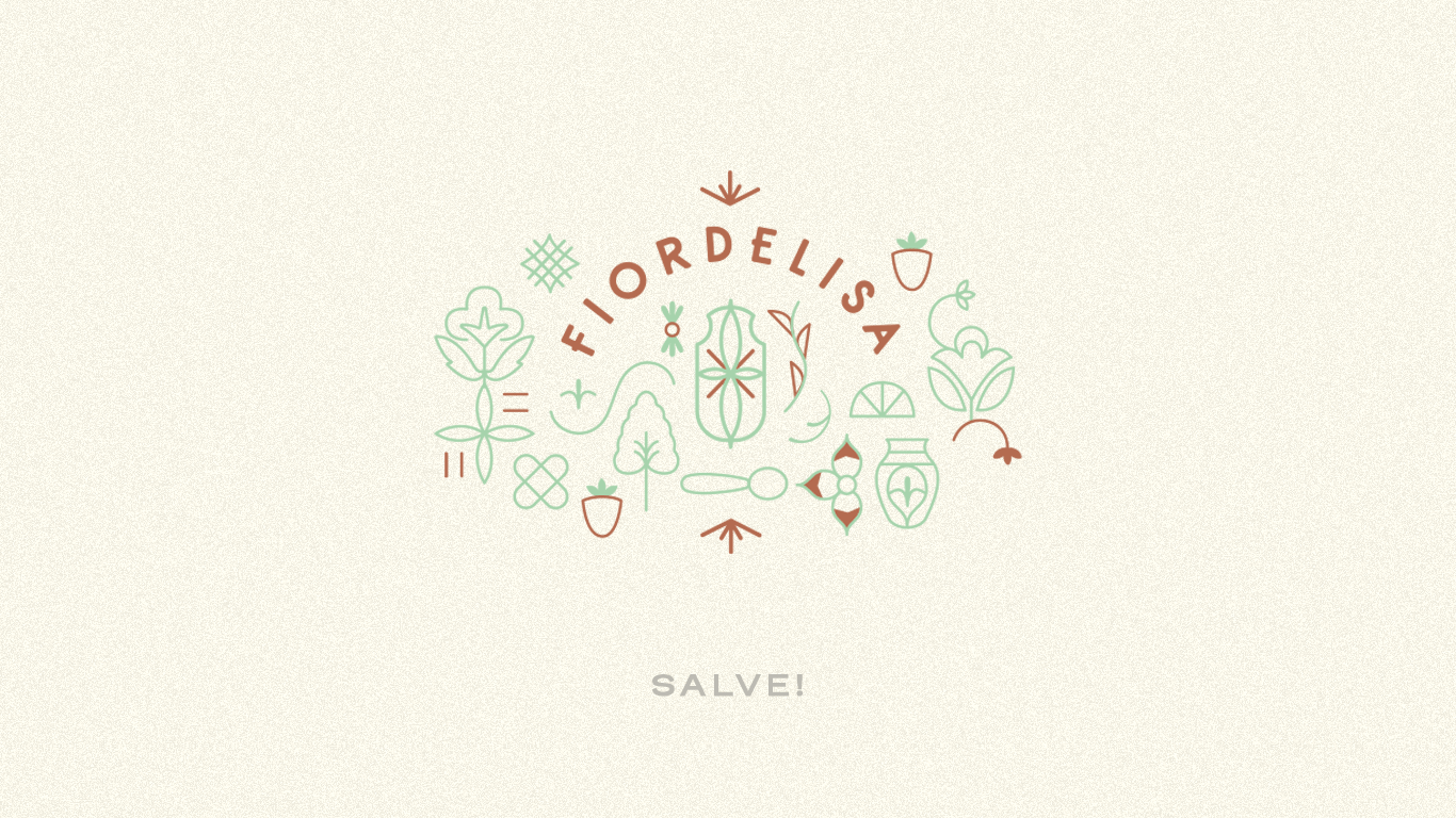
The logo is designed to bring out the delicate botanical side of the gelateria. The emblem is meant to look romantic and nostalgic — representing authenticity. These elements were also based on vintage Italian apothecary jars, which were used for herb storage. This links strongly to the owner’s Italian heritage and family background of field botanists and herb experts.
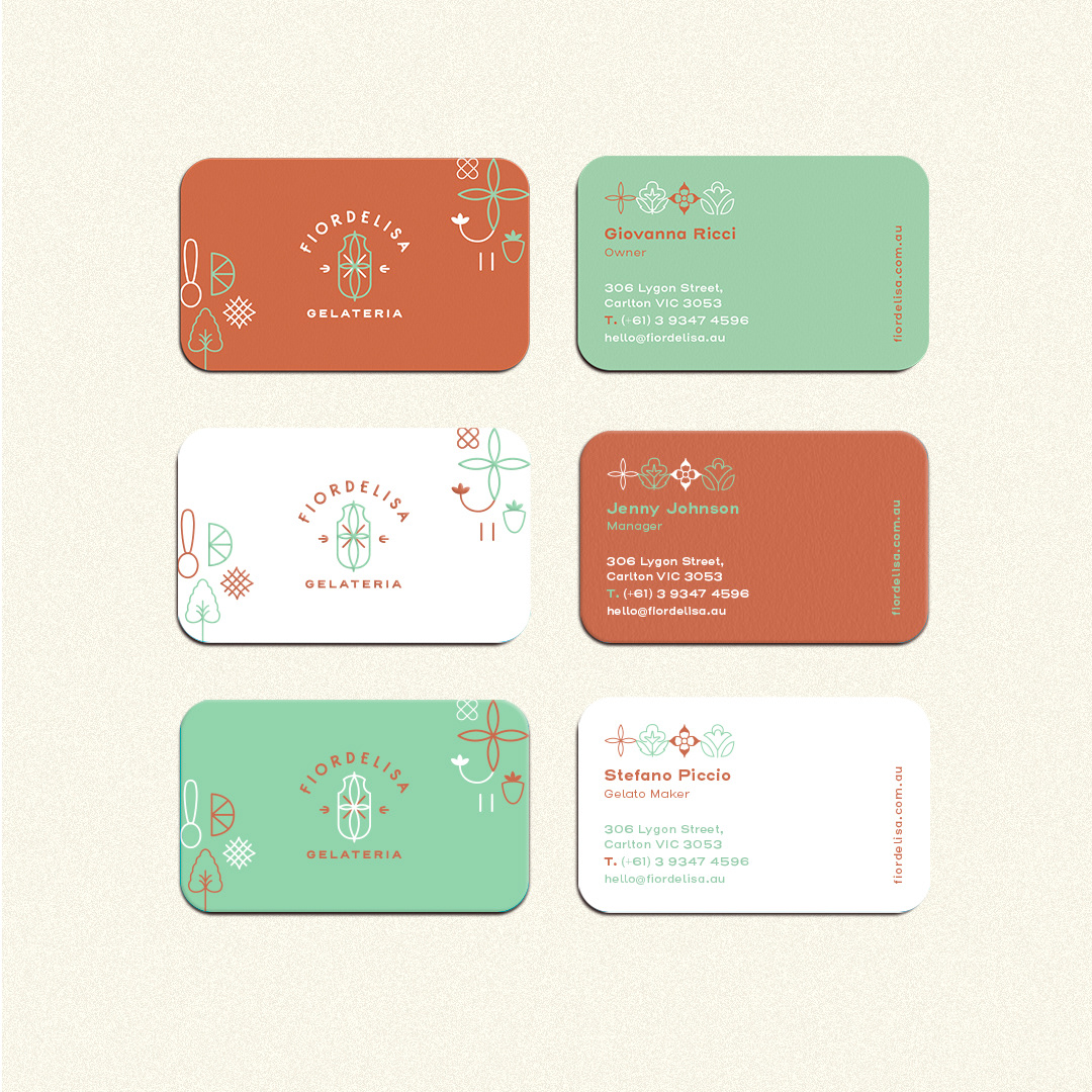
3-way business card with different colours assigned for different job positions/titles.
Some of their signature flavours include White Chrysanthemum with cacao nibs, Lychee Raspberry, Lavender Ricotta, Pandan, Earl Grey and Lemongrass, Midnight Gianduja, Spiced Pear, Peach and Rose with Strawberry Basil.
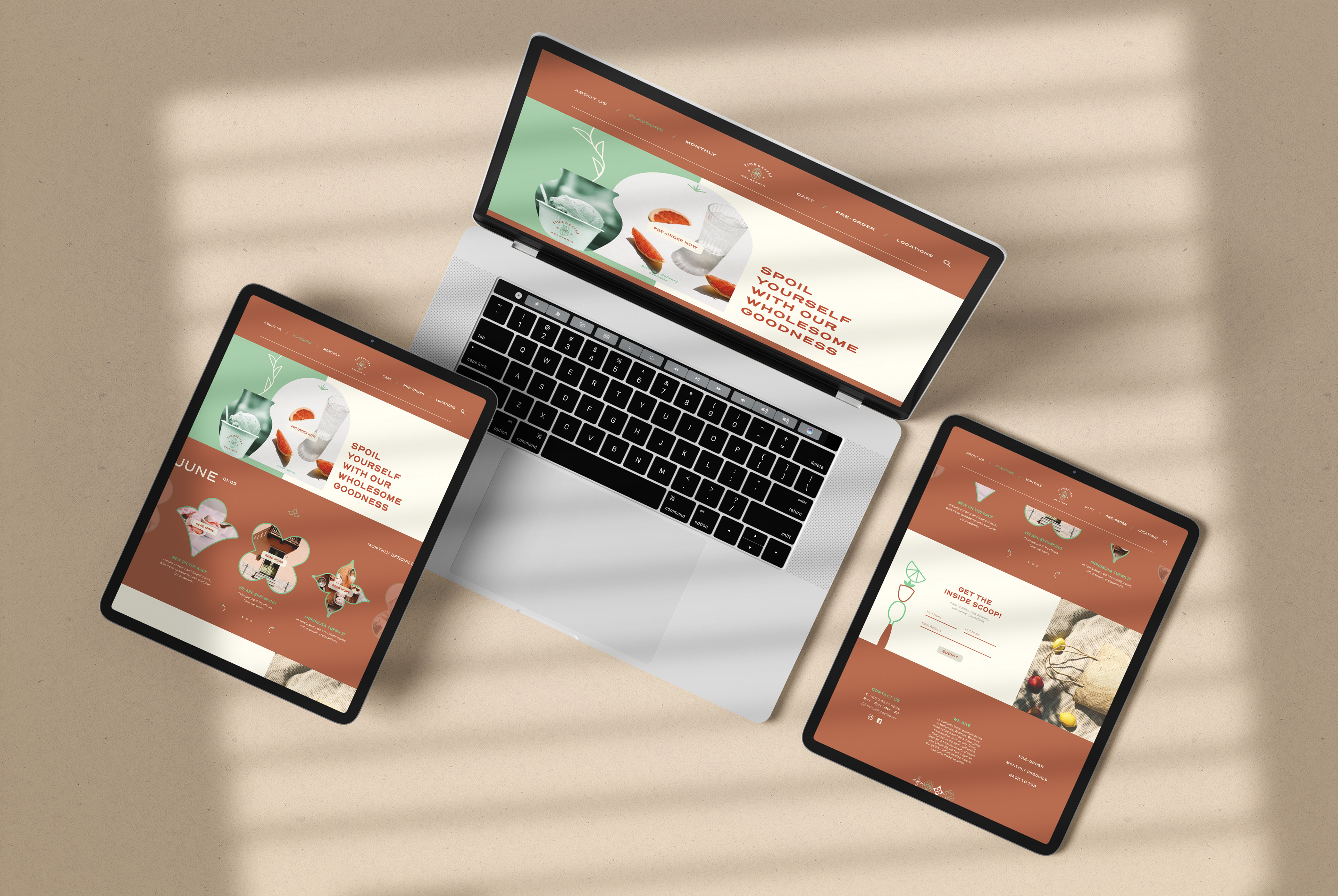
WEB WELCOME PAGE