Roman PTE is a Melbourne based language education centre that is helping people and students from various non-English speaking countries to clear the PTE test for both migration and university admissions.
The main keywords behind the redesign of their logo are mentorship and learning.
WALL MOUNTED SIGNAGE
Mentorship is symbolised as the
2 people that are overlapping inside the cube. This is to emphasise the ‘passing down’ of knowledge.
2 people that are overlapping inside the cube. This is to emphasise the ‘passing down’ of knowledge.
The three lines coming out of the edges
of the cube is inspired from circuit board lines as an extension of how we can expand our knowledge and comprehension
to keep extending and connecting.
of the cube is inspired from circuit board lines as an extension of how we can expand our knowledge and comprehension
to keep extending and connecting.
The whole structure of the logo itself is of a cube that symbolises the many qualities that Roman Education posses in achieving a great and solid foundation as an exceptional language centre.
COLOUR PALETTE
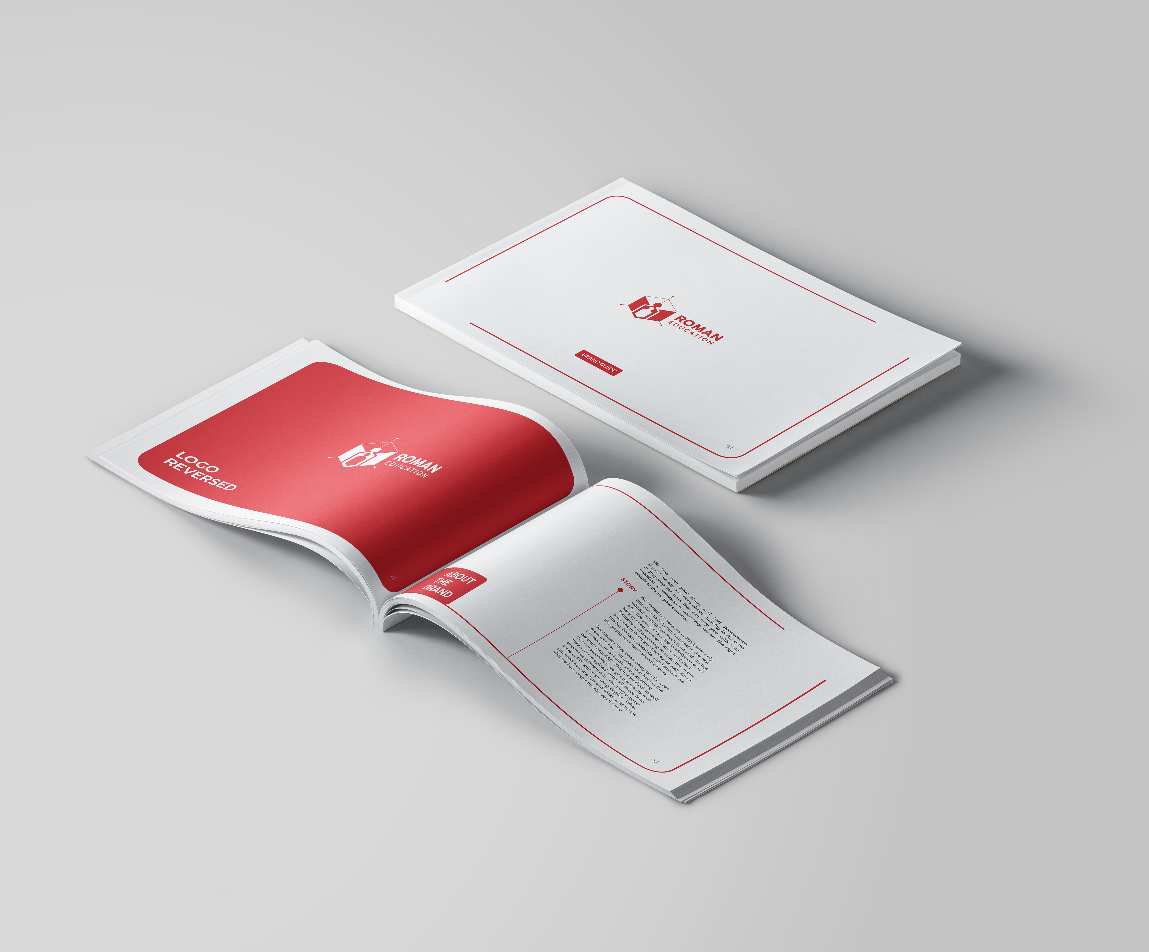
brandguide book.
LOGO CONCEPT DEVELOPMENTS

